
Typography for business: features, errors and tips for entrepreneurs
Companies of all sizes use the power of visuals to attract the attention of their target audience or to make a statement to the entire market. Sometimes new projects that are just emerging in the business environment immediately launch marketing campaigns using non-standard visuals to accelerate development.
This article will talk about what typography is, why businesses need it, and we’ll break down popular mistakes. At the end, you’ll find tips for improving your visual style.
What is typography
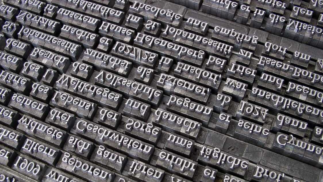
Leaving out the technical details, typeface is the language used to speak to the target audience. If the logo is written in such a way that you can’t read the lettering, users will have difficulty identifying the brand.
Such mistakes are not uncommon because many companies ignore typography and don’t pay enough attention to visual style. They believe that unique and useful products will do the trick. Customers will realize that similar products don’t exist anywhere else and will continually place orders.
If a company sells smartphones or other technology, the user experience is highly dependent on the quality of the device. No one is going to pay for a phone that is going to get very hot or “explode” in their hand after a few weeks.
Apple products aren’t just bought because they offer features other companies don’t have. One of the strengths of the “Apple” corporation is its unique visual style, which is used for the design of devices and the interface of operating systems.

The quality of products or services always comes first for commercial companies, but a good visual style will help leave a stronger imprint in the memory of the target audience. When people see a logo on any piece of equipment in the form of a bitten apple, they immediately understand that the device came out from under the Apple machine.
Typography is important for any level of commercial project. Even if we’re talking about a small online store that launched two months ago. It’s best for the brand to enter the market in full “combat” readiness. It already has a logo, corporate identity and visual concept.
The right typeface combined with a beautiful visual can work wonders. For example, if the online store sells a large number of products and can not yet provide all the products with photos, you can temporarily replace them with relevant illustrations.
Usually, for the design of the site uses no more than 2-3 fonts that are in harmony with each other. If there is no visual coherence between them, the design will fall apart before your eyes. Avoid such situations helps to complex analysis, which is carried out before the visual components appear in the public domain.
Combining fonts with different lettering is difficult. Especially if you don’t use a classic combination, but rather create a unique scheme that will identify a particular brand.
Thin, italic, bold and other fonts are used for their own purposes, so you need to use the right style. For example, bold highlights fragments that users need to pay attention to.
There are serif fonts, which are characterized by the presence of small strokes. These typefaces are part of the “Antiqua” group and are mainly used for typesetting the main text.
If you dive headfirst into the world of typography, then to study all the features will take a lot of time. So it is better to entrust the task to a designer with extensive experience, who will be able to build a visual style of the brand.
The secret of high-quality typography is as simple as possible. It is necessary to feel the nature of the company and convey it through fonts and visual symbols. It is important to understand that interface designers will not be able to produce the same result as a specialist who creates a corporate identity every day.
Why businesses need typography
Imagine if there was only one font in the world. Street signs, road signs, and even text on smartphones would all look the same. Users couldn’t tell one brand from another. They would become a solid blur that is impossible to identify.
In the real world, there are a large number of fonts that you can use to solve your problems. You can even have an expert design your own typeface, legally reserve the rights to it, and take legal action if someone uses the work inappropriately.
If you expect that an unusual font will instantly become to bring in customers, it is better to give up on this idea. Visual style enhances the appeal of products or services, but on its own does not sell anything.
You can make a simple analogy with food. For example, you ordered a salad at a restaurant, but it turned out to be tasteless. It turns out that the chef didn’t put salt in it, and without salt, it tastes completely off. So the font and the typography as a whole is the salt. You can sell a salad without it, but there won’t be much demand.
A good font and a unique visual style start working for the brand almost immediately, and after a while the target audience will easily distinguish the brand’s products from hundreds of alternatives.


